How an empathy-driven, mobile-first feature that assessed students' exam readiness and prioritized study concepts drove a 13% increase in conversion within its first three months.
Overview
At 240 Tutoring, students preparing for licensing exams often struggled with a fundamental question — not just what to study, but where to start. As both the lead designer and product manager on this project, I had the opportunity to address that uncertainty head-on.
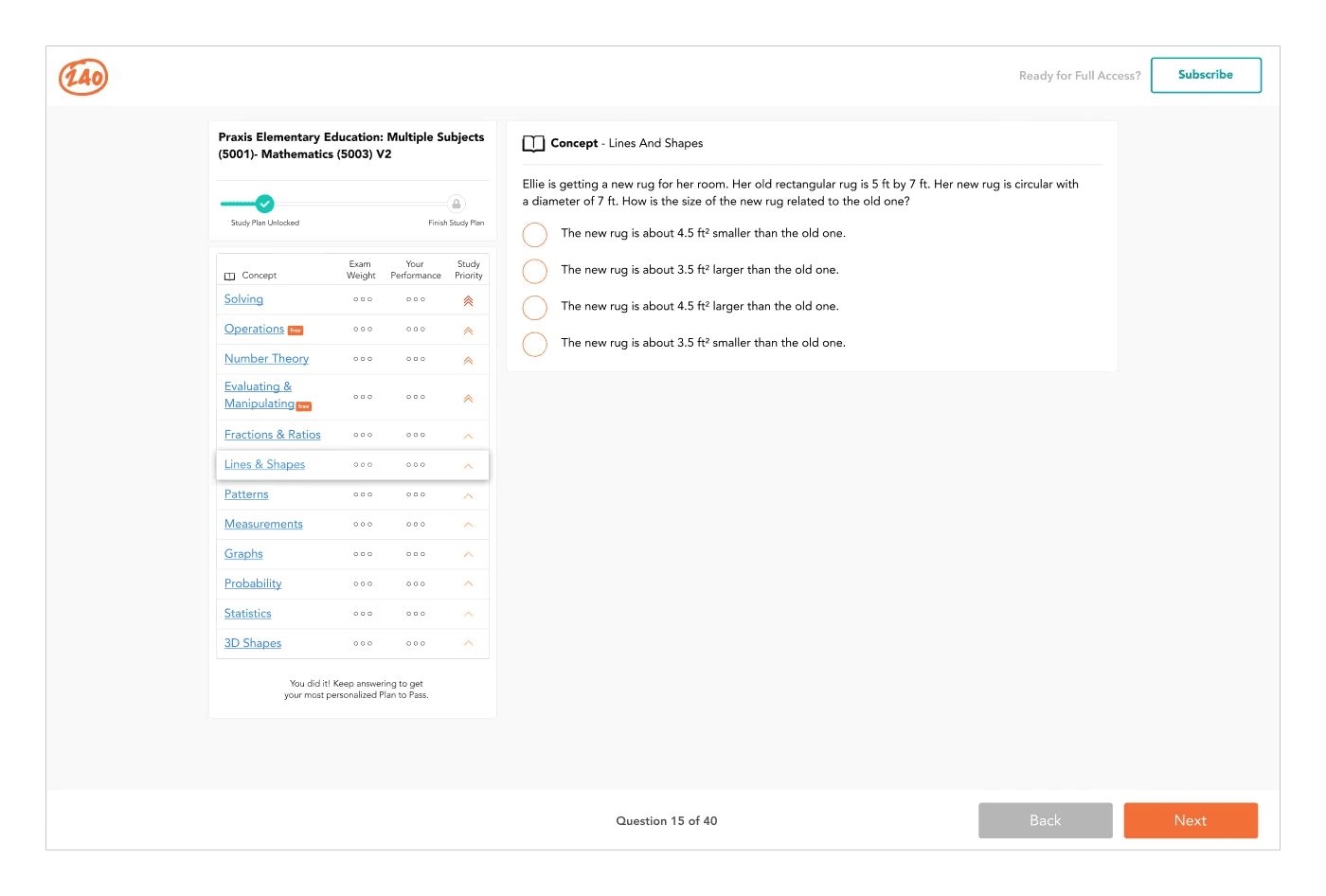
The mission: develop a feature that assessed students' study priorities and provided empathetic, personalized guidance tailored to their unique needs — leveraging 240's internally developed content mapping within the CMS to offer precise recommendations on where to focus.
Goals
By letting users experience the product's value before committing, we aimed to broaden the user base and lower the barrier to entry for new students.
Give students a clear, personalized roadmap — guiding them on where to start and what to focus on based on their actual performance data relative to exam weight.
Role & Responsibilities
For this cross-functional project, I served as both lead designer and product manager. This dual role allowed me to bridge the gap between user-centric design and strategic project management — ensuring seamless collaboration between the creative and technical sides of the team.
Led all design work from user research through final high-fidelity Figma prototypes. Ensured brand alignment and a mobile-first experience that fit seamlessly into the existing application.
Translated user insights into actionable project goals, prioritized features with the team, managed cross-functional collaboration between content and development, and ensured scalability of the solution.
Design Process
My process began with an unwavering commitment to understanding both our users and the business need. I spent significant time collaborating with users and researching best practices before touching Figma.
Conducted comprehensive user research and interviews to understand not just what students needed, but their fears and aspirations around exam preparation.
Worked closely with content and development teams to translate user insights into actionable goals and identify which features would best serve our users.
Embraced a mobile-first approach in Figma, ensuring the feature was responsive, brand-aligned, and user-friendly across all device sizes.
Iterated with content and development teams to craft the most effective user experience — refining until the solution felt right for both users and the business.
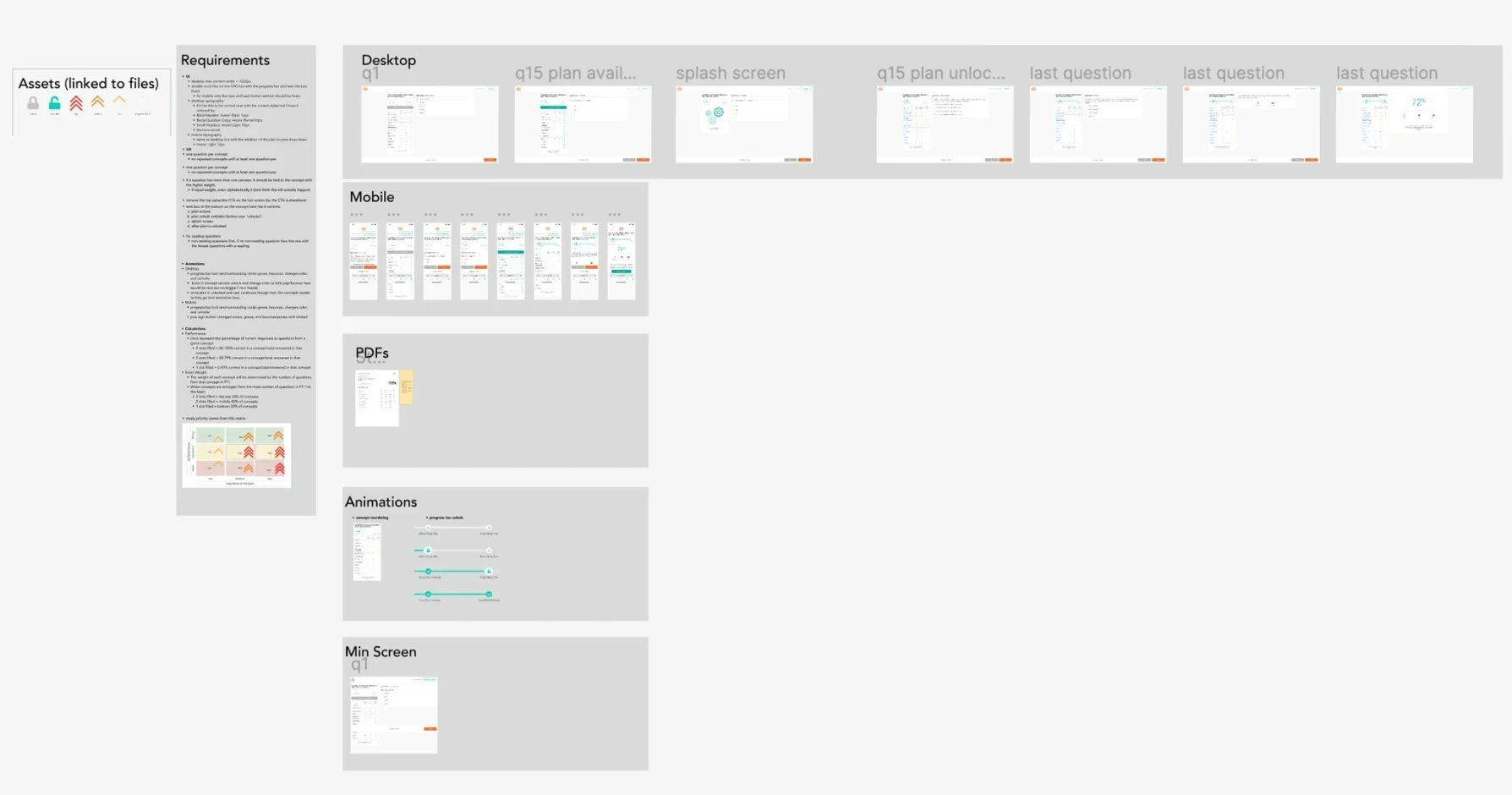
Design explorations and mobile-first iterations
Launch & Results
In February 2023, we unveiled "Plan to Pass" to our user base. The feature empowers students to assess their exam readiness by comparing their performance to the exam's weight — surfacing a clear, prioritized roadmap that tells them where to start and what to focus on.
Allowing users to demo the product before committing was a key part of the launch strategy. It let students experience the value of personalized guidance firsthand — building confidence in 240's curriculum before asking for a purchase decision.
Increase in conversion rates within the first three months of launch — driven by letting users demo the product and experience personalized guidance before converting to paid.
Reflections
Going beyond data to understand students' fears and aspirations shaped every design decision. It's what moved us from a functional feature to one that genuinely resonated with users.
Wearing both hats meant I could make faster, more coherent decisions — and bridge gaps between what users needed and what the team could realistically build.
The freemium demo strategy was core to the 13% conversion lift. Asking users to trust before they've felt the value is a barrier. Removing that barrier changed everything.
Building "Plan to Pass" with integration across the full app in mind from the start meant the feature could grow without requiring a full redesign — a decision that paid off immediately.