The Problem
Fundraisers were flying blind inside their own CRM
Bloomerang's Campaigns, Funds, and Appeals sections were purely administrative — flat paginated tables that showed you what existed, but told you nothing about how it was performing. Name, status, date range, amount raised. That was it.
To answer even a basic question — how is our Spring Campaign tracking against goal? — a fundraiser had to leave the page entirely, navigate to Reports, manually configure filters, run the report, and interpret the output. Every insight required a trip through the report builder. For organizations running multiple campaigns, funds, and appeals simultaneously, this wasn't just inefficient — it was a barrier that kept people from using the data they were already tracking.
The reporting tax
Bloomerang's own help documentation tells users: "Group a transaction report by funds to see the incoming revenue for each area of your organization." Every data point required a deliberate, multi-step manual process. The CRM held rich data — it just made users work hard to surface any of it.
Before State
A list of names, a handful of columns, nothing actionable
The starting point was a flat table — campaigns sorted by name, with columns for status, type, date range, raised amount, goal, and % to goal. Clicking into a campaign gave you its settings. No charts, no trends, no breakdowns. Just the same administrative fields you used to create it.
The same pattern repeated across Funds and Appeals. Three sections of the product, all structured the same way: lists that managed records, but never helped users understand them.
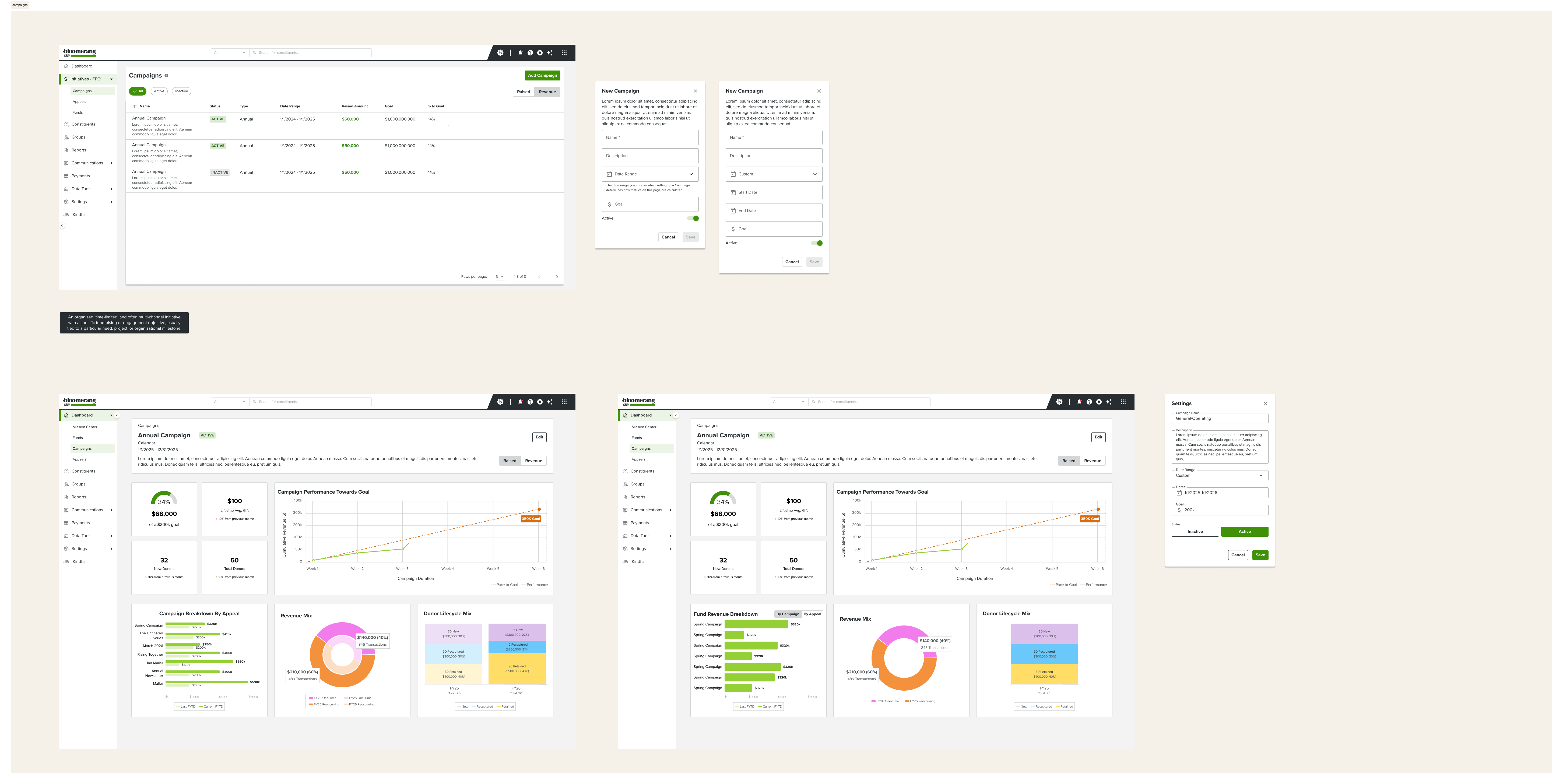
The new campaigns list (top) showing at-a-glance status and metrics, and the campaign detail dashboard (bottom) replacing what was previously a blank settings page
Design Process
Built and tested in parallel, iterated with users at every stage
This project used a different process than a typical design cycle. Rather than sketching in isolation and returning weeks later with polished mockups, working prototypes were built using Claude, Figma AI, and MCP — and brought directly into user conversations while they were still rough.
That shift changed what was possible in a single session. Instead of presenting one direction and gathering reactions, multiple approaches could be tested, adjusted, and compared in real time. Users weren't describing what they thought they wanted — they were responding to something they could actually interact with.
The project ran through multiple rounds of user research, with design evolving after each one. Nothing was finalized between rounds and presented as complete — the process stayed open and responsive throughout.
Discovery & scoping
Mapped what data Bloomerang already had for campaigns, funds, and appeals — and identified the gap between what existed in the system and what fundraisers actually needed to see to make decisions.
Rapid prototyping with AI tools
Used Claude, Figma AI, and MCP to build working prototypes quickly — generating multiple dashboard directions, chart component variations, and navigation structures without lengthy build cycles between iterations.
Live iteration with users
Brought prototypes directly into user sessions — adjusting direction in real time based on what users were doing and saying, rather than returning later with a refined version of an assumption.
Multi-round research & refinement
Iterated across multiple rounds of user research for each of the three sections — campaigns, funds, and appeals — evolving the design after every session rather than treating any round as final.
Component & chart exploration
Systematically explored every visualization type — revenue mix donuts, donor lifecycle stacked bars, gift range distributions, year-over-year growth lines, pace-to-goal charts — testing which representations actually helped users answer their most common questions.
Exploration
Every chart type, every layout — explored before committing
Before settling on the final dashboard composition, a systematic exploration of chart components was conducted across all three sections. Revenue mix visualizations alone went through seven variations — different color treatments, data groupings, and comparison approaches — before the right balance emerged.
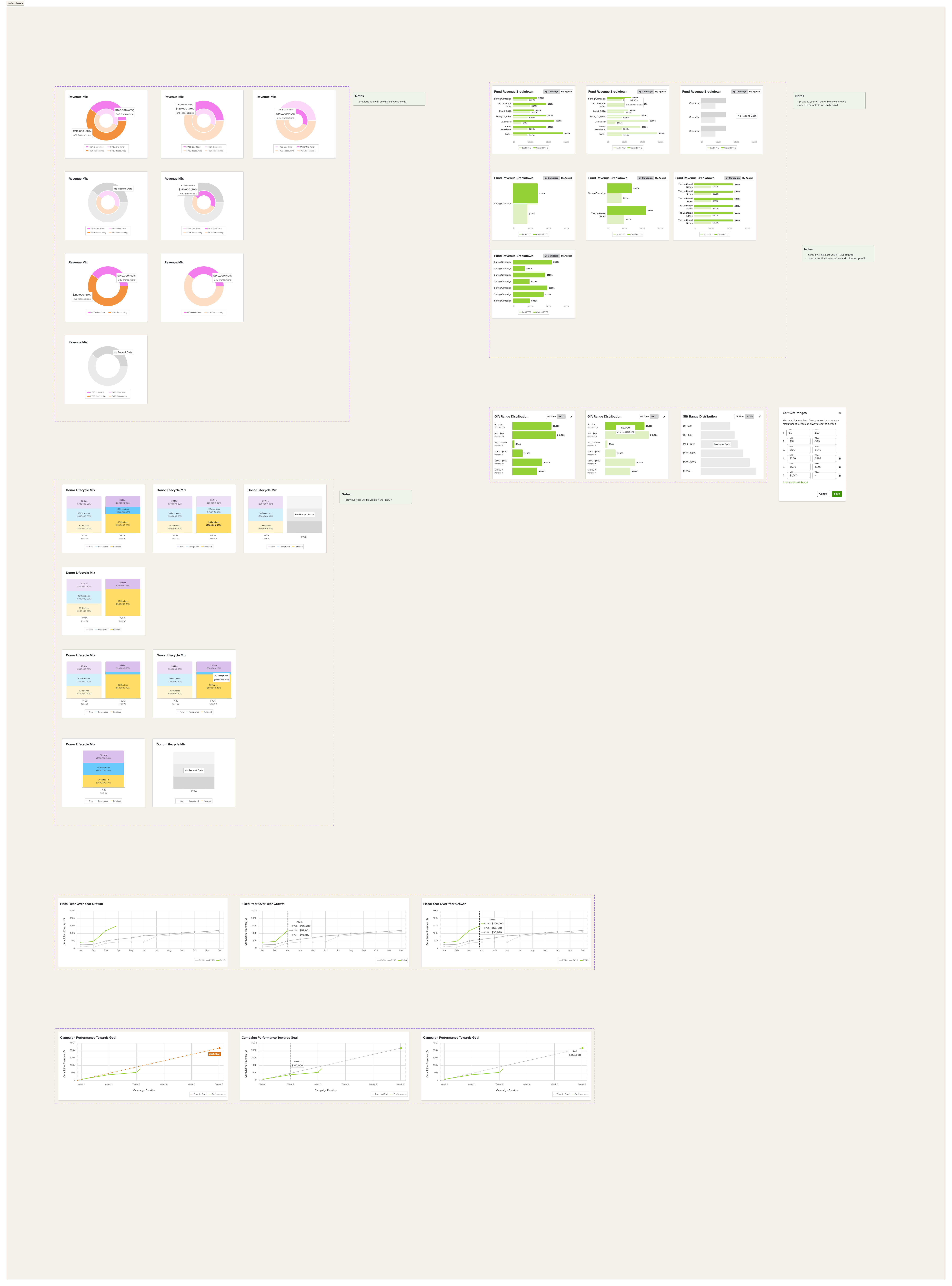
Component exploration across revenue mix, donor lifecycle, gift range distribution, year-over-year growth, and pace-to-goal chart types
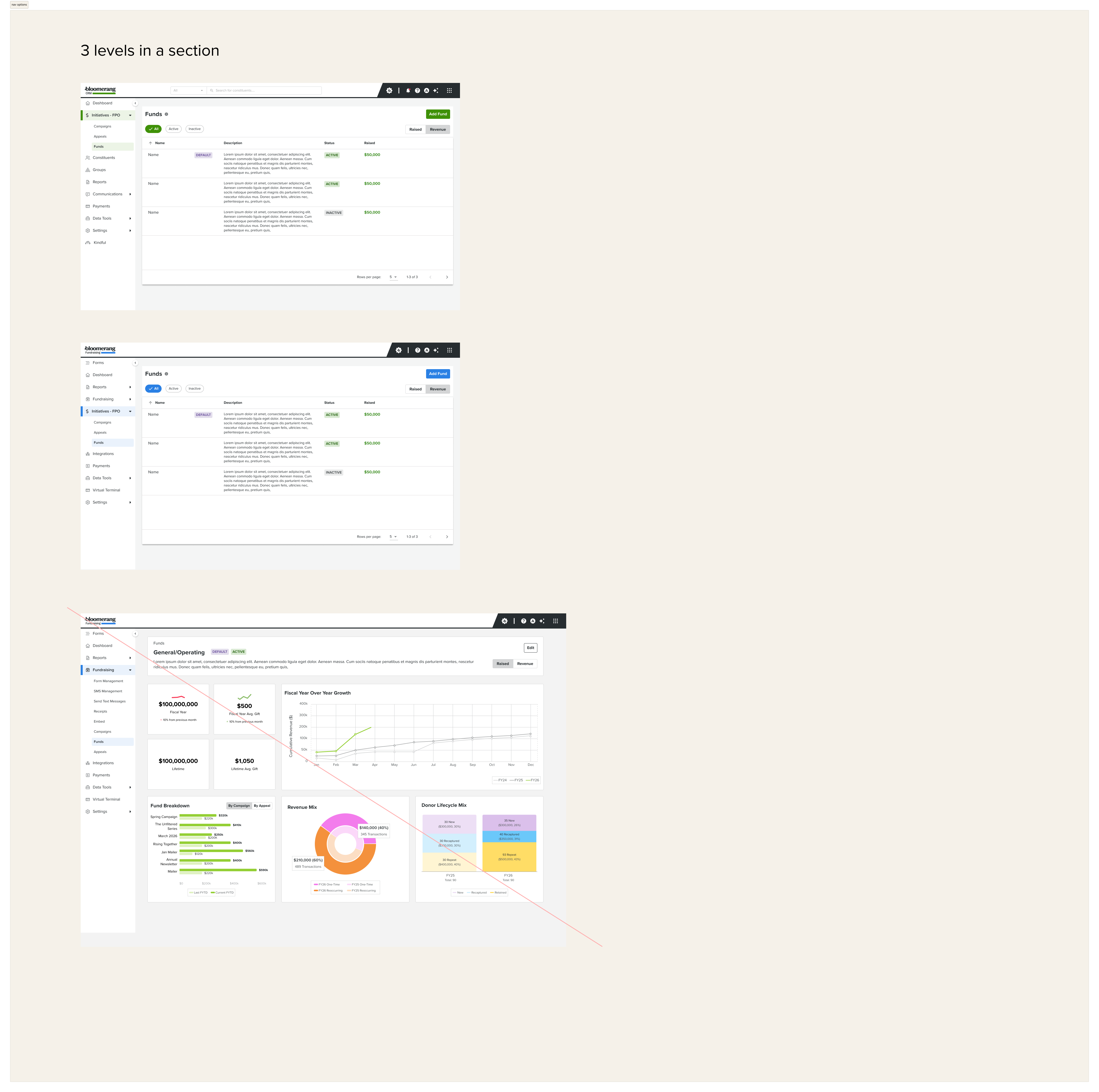
Navigation structure exploration — testing how Campaigns, Funds, and Appeals should sit within Bloomerang's information architecture across two and three-level nav models
Prototype Evolution
Three surfaces, iterated in parallel
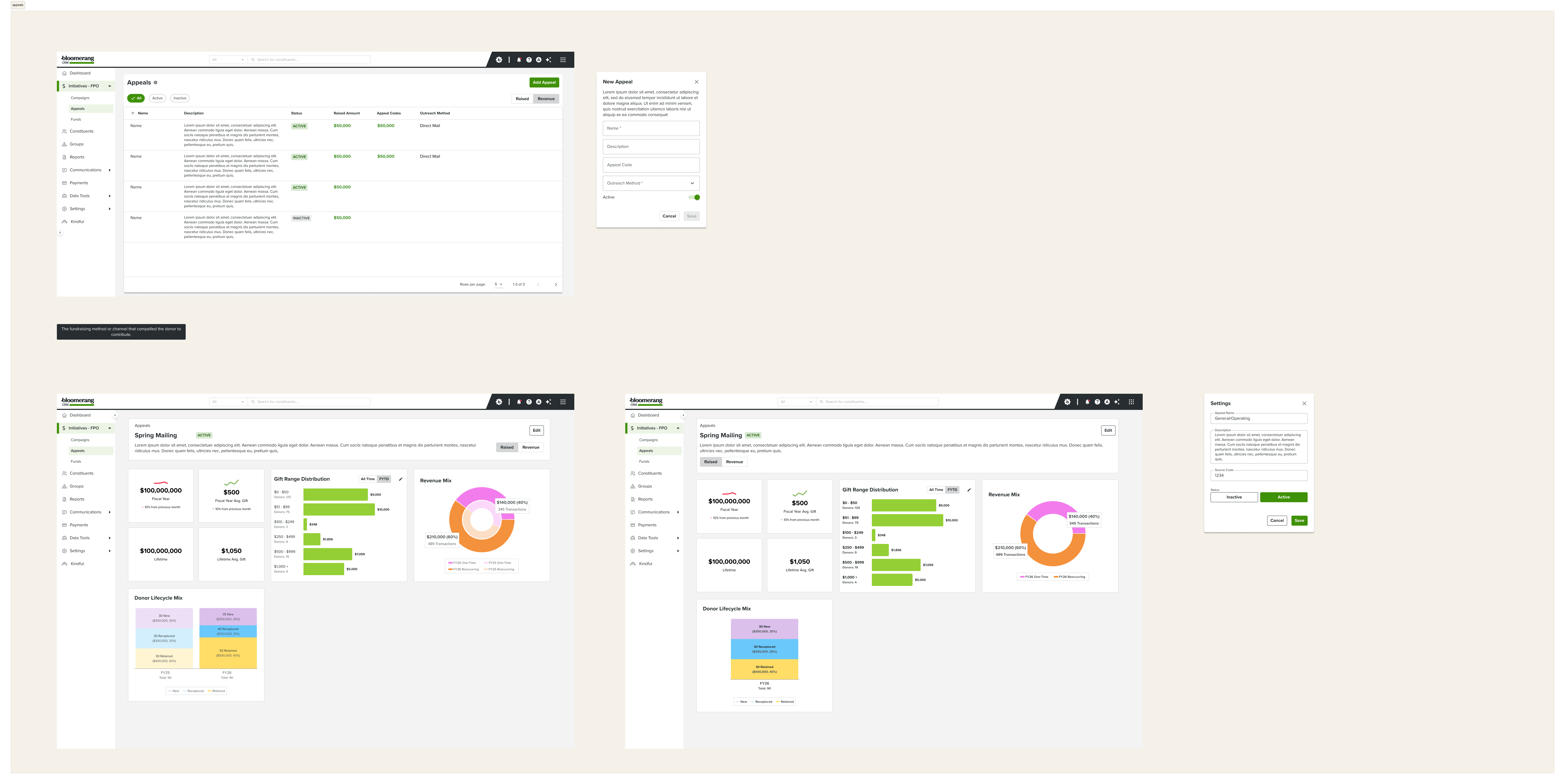
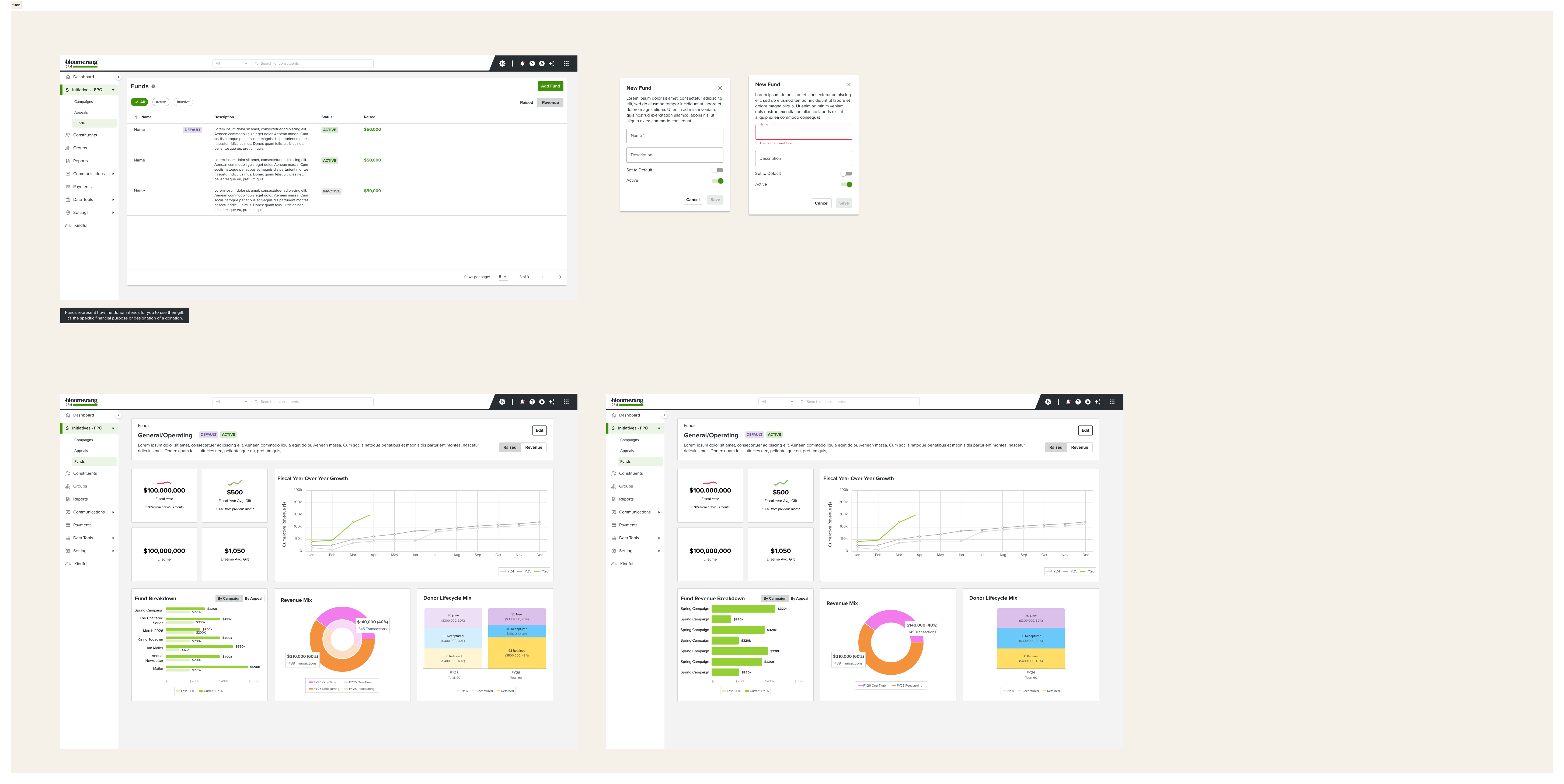
Campaigns, Funds, and Appeals each followed the same pattern but required different dashboard compositions. Campaigns needed pace-to-goal tracking and breakdown by appeal. Funds needed year-over-year cumulative performance. Appeals needed gift range distribution and donor lifecycle comparisons. Each section developed through its own research arc while sharing a consistent design system.
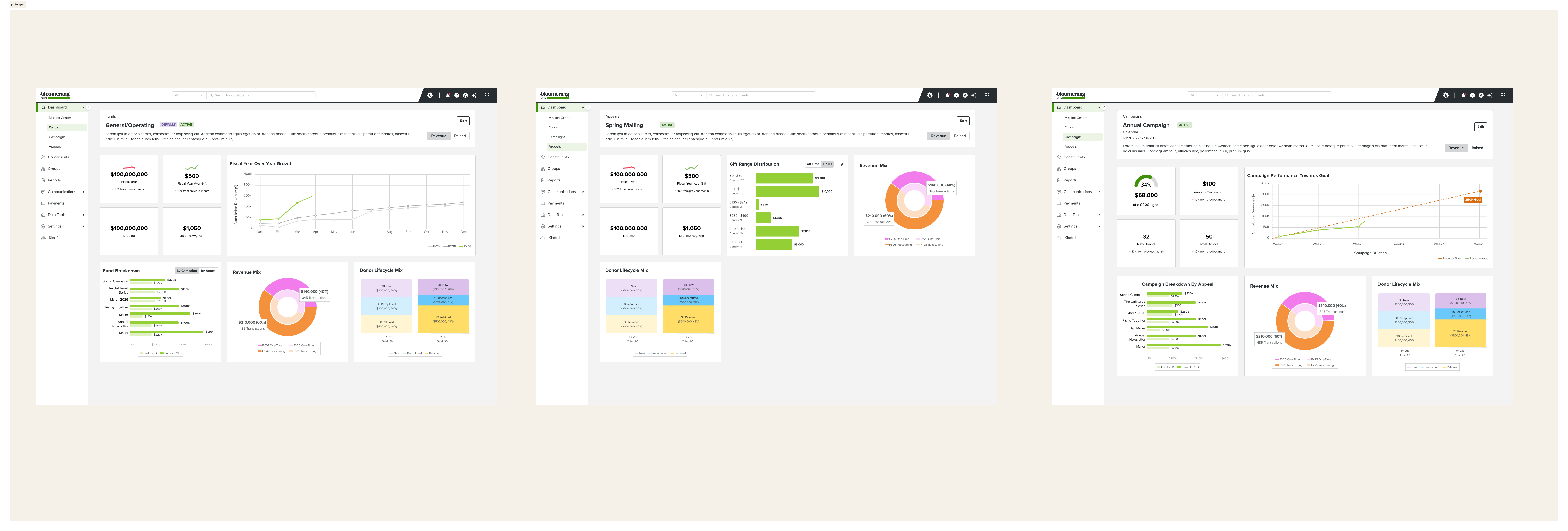
Funds, Appeals, and Campaigns dashboards side by side — three distinct dashboard compositions built on the same underlying system
Final Designs
Data that was always there, finally visible
Each section got a dedicated dashboard built around the questions fundraisers actually ask — not just what data happened to be easy to surface. Clicking into any campaign, fund, or appeal now shows an immediately readable picture of performance, with every element clickable to launch a pre-filtered report for deeper investigation.
That last detail — click-through to reports — was deliberate. The dashboard isn't meant to replace reporting; it's meant to make the path to reporting instant. Instead of starting from a blank report builder, users start from a question the dashboard already surfaced for them.
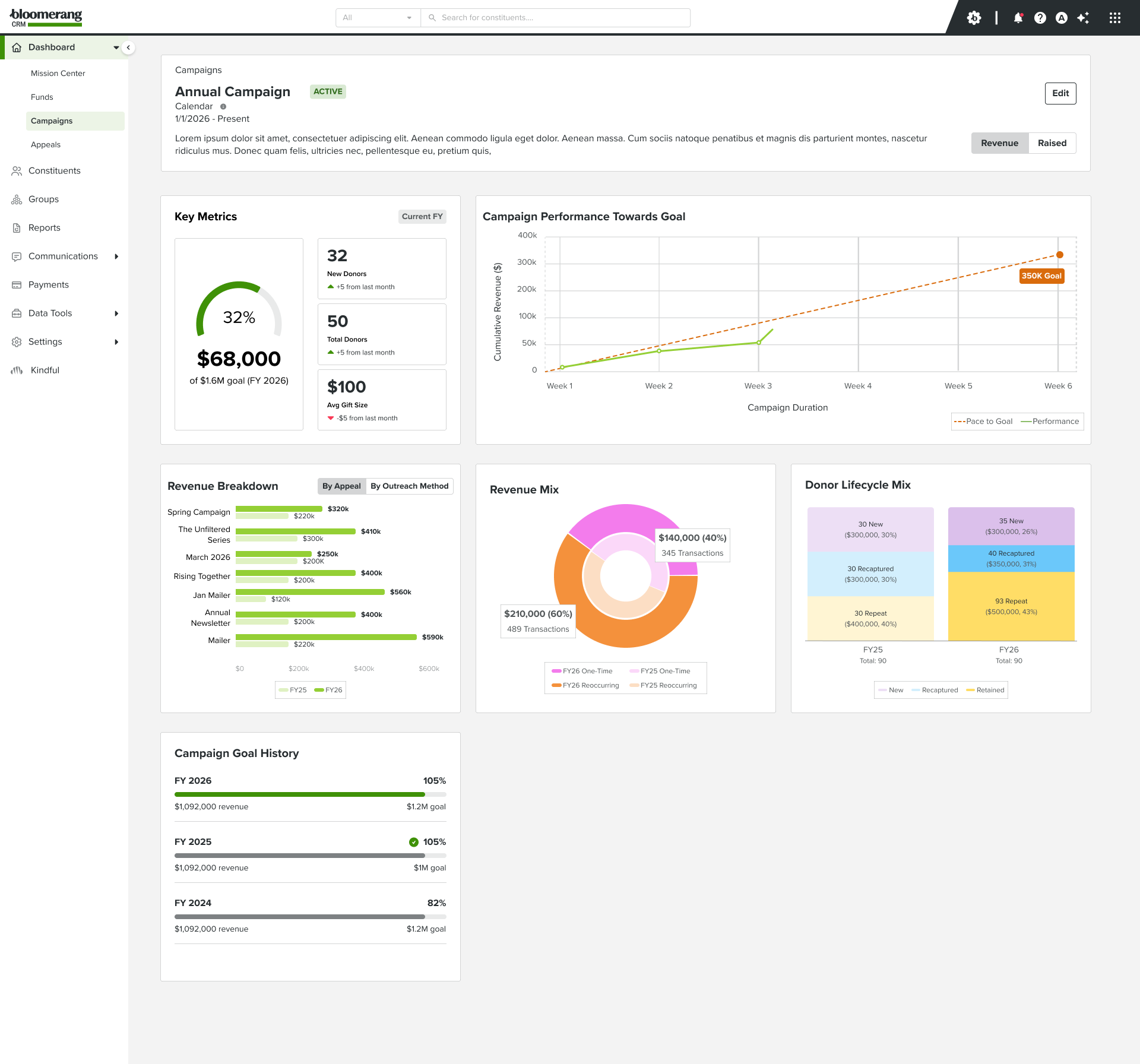
Campaign detail dashboard — key metrics, pace-to-goal chart, revenue breakdown by appeal, revenue mix, donor lifecycle comparison, and campaign goal history across fiscal years
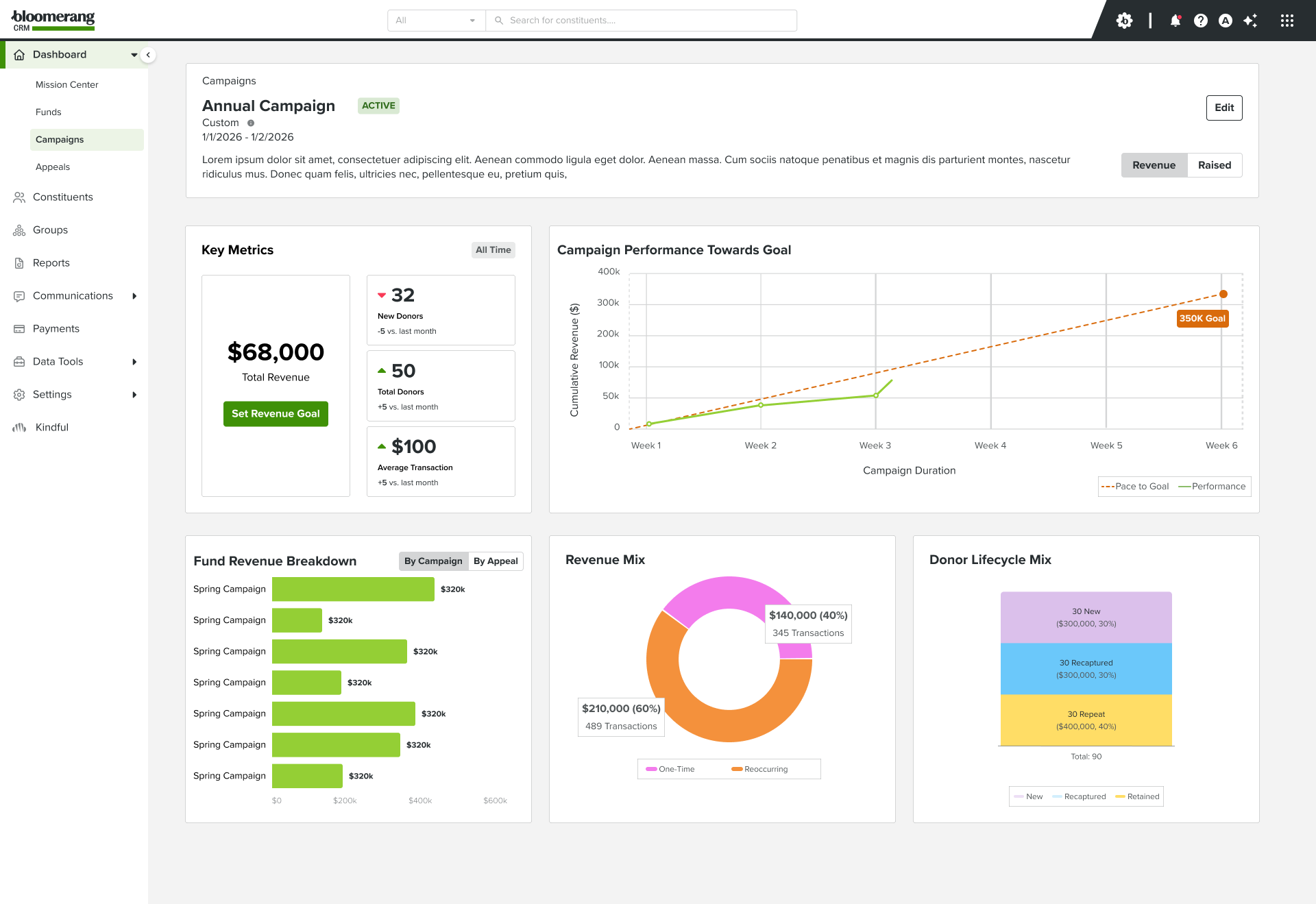
Custom date range view — the same dashboard adapts to show data for any time period, with fund revenue breakdown replacing the campaign breakdown
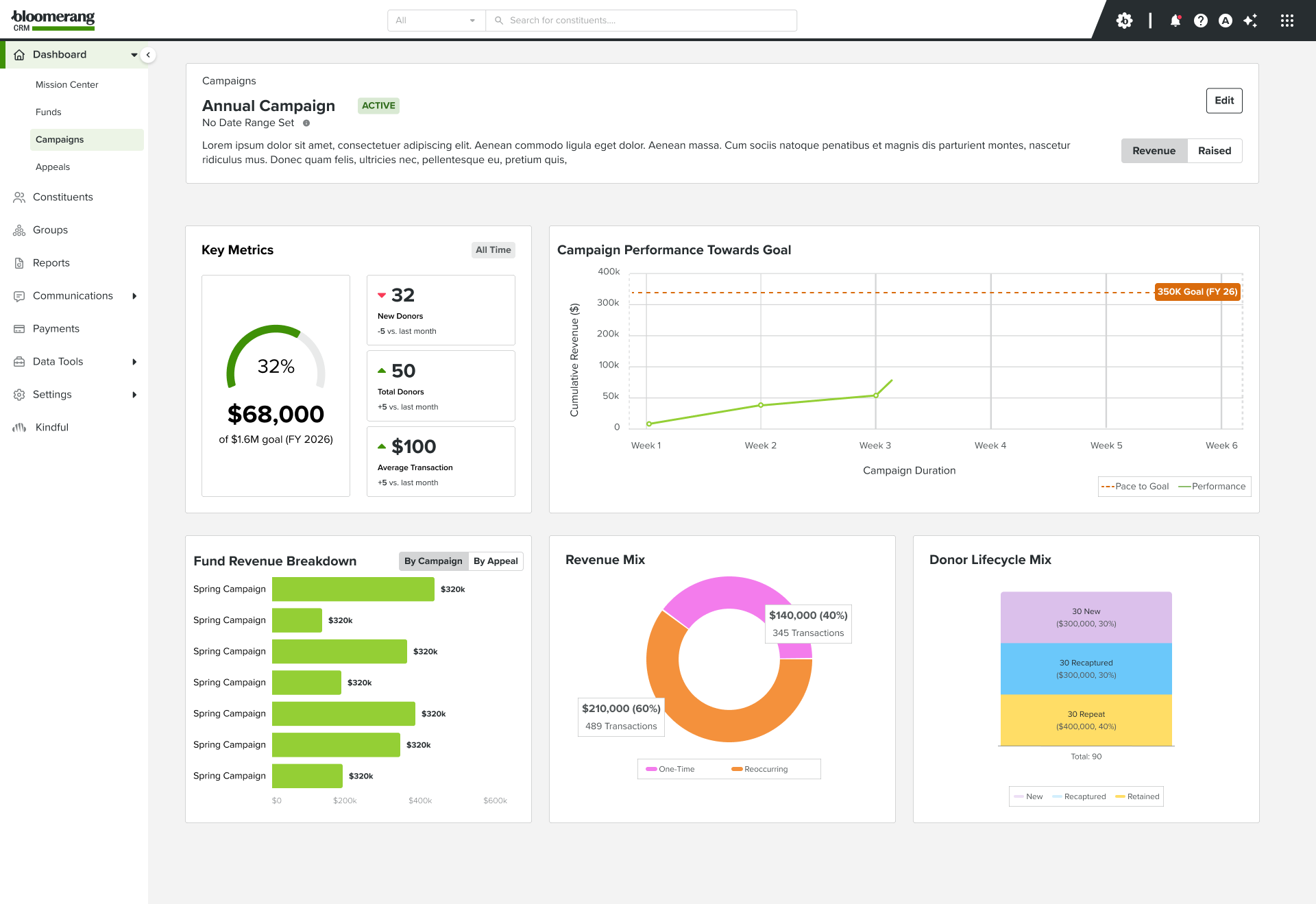
Empty state design — when no revenue goal is set, the dashboard prompts users to set one rather than showing a blank chart
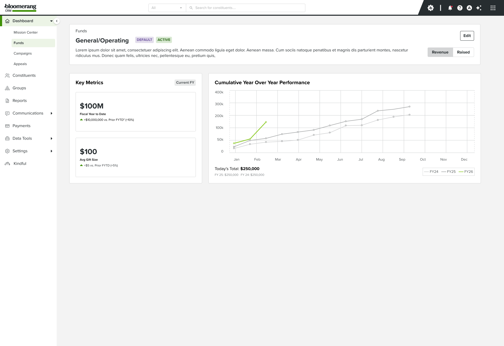
Funds detail dashboard — year-over-year cumulative performance chart, fund revenue breakdown, revenue mix, and donor lifecycle across fiscal years
.png)
Appeals detail dashboard — key metrics with prior year comparison, gift range distribution, revenue mix with year-over-year comparison, donor lifecycle mix, and breakdown by appeal code
Broader Context
One approach, applied across six months of product work
This wasn't a one-off experiment. The same AI-assisted design method — rapid prototyping, live iteration, multi-round user research — was applied across a sustained six-month stretch of product work at Bloomerang, spanning campaigns, funds, appeals, bulk data update and delete tooling, and data visualization work.
The shift wasn't just in the tools used, but in the rhythm of the work. Faster prototyping meant more time in front of users. More time in front of users meant fewer assumptions carried into final designs. The AI tooling compressed the distance between "idea" and "testable thing" — which changed what was possible in a single research session.
Impact
The data was always there. Now it's just there.
The most meaningful shift wasn't adding new data — it was removing the steps between users and data they already owned. Before, every insight required a deliberate detour through the report builder: configure filters, choose columns, run the report, interpret results. After, the same information is visible the moment you open a campaign.
The addition of click-through report launching from any dashboard element further collapsed that gap. Users don't just see that their Spring Campaign is behind pace — they can immediately drill into why, with the report pre-configured from the chart they were already looking at.
The feature was in development at the time of writing and had not yet fully shipped — but the design direction was validated across multiple rounds of user research, with fundraisers consistently describing the dashboards as the first time they felt like the CRM was working with them, not making them work for it.
Reflections
What this changed about how I design
Speed to testable is the real leverage
The biggest shift wasn't in the quality of individual designs — it was in how quickly something testable existed. Compressing that gap changes everything about how you use research time.
Users react to things, not descriptions
Bringing rough, working prototypes into user sessions surfaced reactions you can't get from asking people what they want. Behavior in the moment is more honest than secondhand description.
The data was already there
The biggest design insight on this project had nothing to do with charts or components — it was recognizing that the friction wasn't a data problem. The data existed. The problem was access.
Click-through changes the relationship to data
Making every dashboard element a launch point for a pre-configured report turned passive information into an active starting point. That detail shifted the dashboard from a summary into a tool.