The Problem
A neighborhood full of resources nobody could find
In my neighborhood, people own tools, equipment, and skills they'd happily share — but there's no organized way to discover or borrow them. Elderly neighbors especially need help with seasonal tasks like snow removal but don't always know who on their street has a snowblower or is willing to help.
The goal was to design a simple, accessible app that connects neighbors with shared resources — with accessibility as a first-class constraint from the very beginning, not an afterthought.
Design Process
Concept to Figma in three phases
The project moved through three distinct phases using Claude as a design and product thinking partner throughout.
Concept Definition
Scoped the project through targeted questions: who the users are, how they log in, what resource types to support, where data lives, and which features matter most — before any pixels were touched.
Interactive Prototype
Built a working HTML/JS prototype with auth, resource browsing, checkout, and sharing flows. When the primary users were identified as elderly neighbors, the entire prototype was rebuilt with accessibility as a first-class constraint — 52px minimum touch targets, high-contrast styling, and plain language throughout.
Figma Design File via MCP
Using Figma's MCP integration, Claude programmatically created a design file and built all 9 screens using the Plugin API. Iterative updates — adding screens, modifying fields, shifting layouts — were handled without rebuilding from scratch.
All Screens
9 screens covering the full user journey
All screens were built programmatically via Claude's Figma MCP integration — from sign-in through resource sharing.
Featured Flow
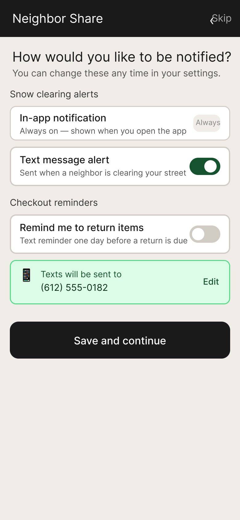
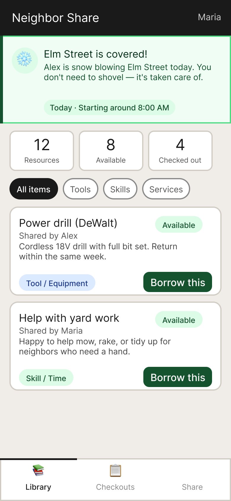
Snow clearing alerts — designing both sides
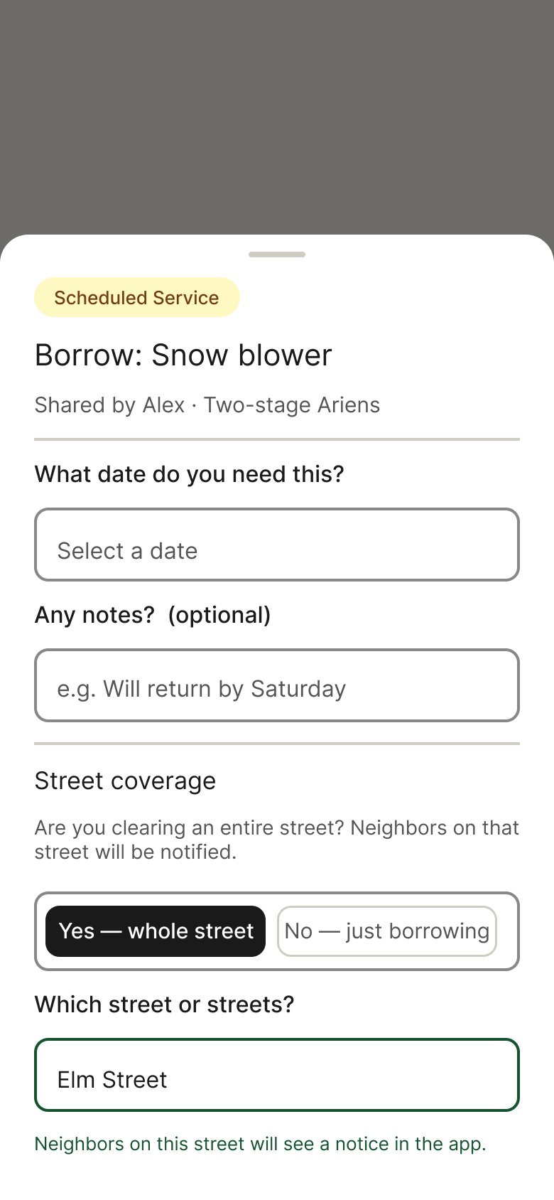
The most interesting design problem was the snowblower street coverage feature. It required thinking through both sides of the interaction — the person checking out the snowblower and the neighbors who benefit.
Key Design Decisions
Accessibility drove every decision
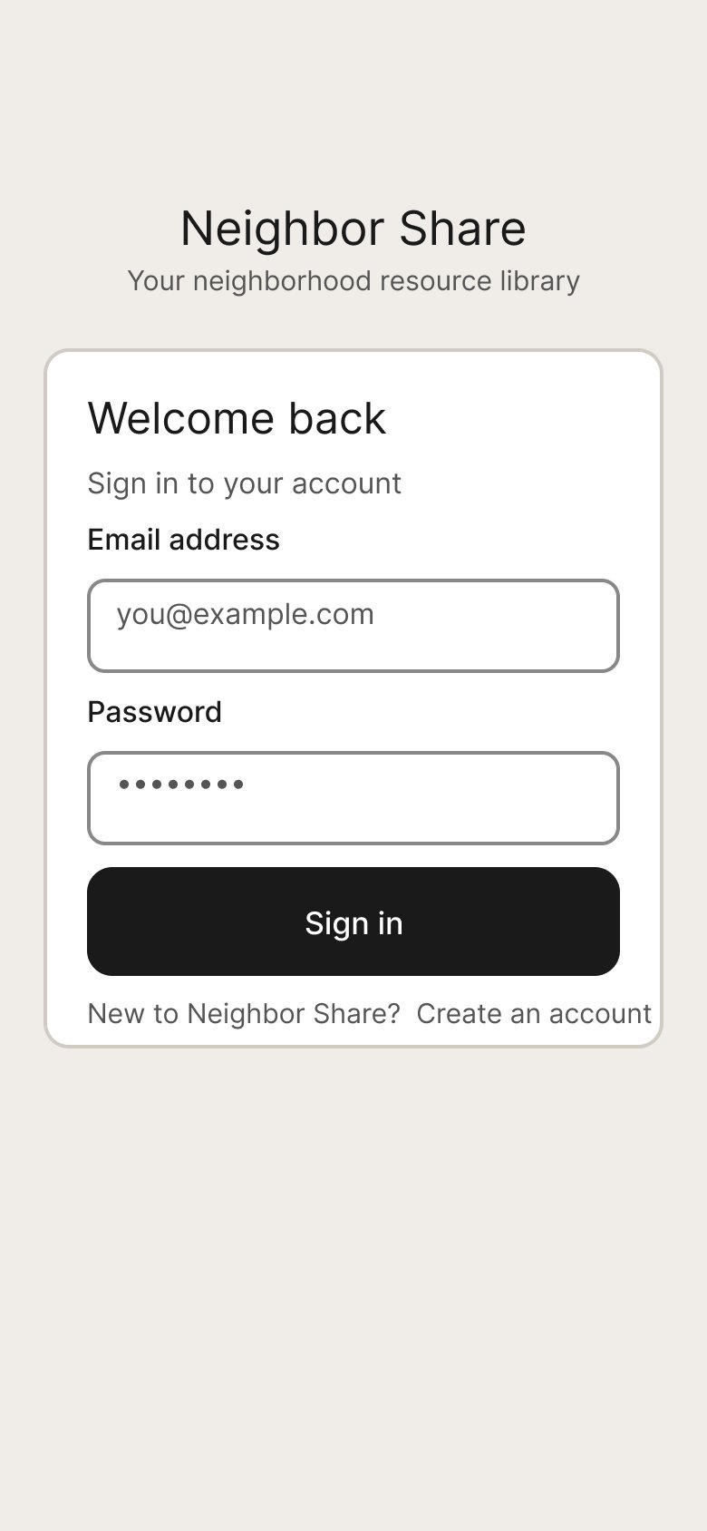
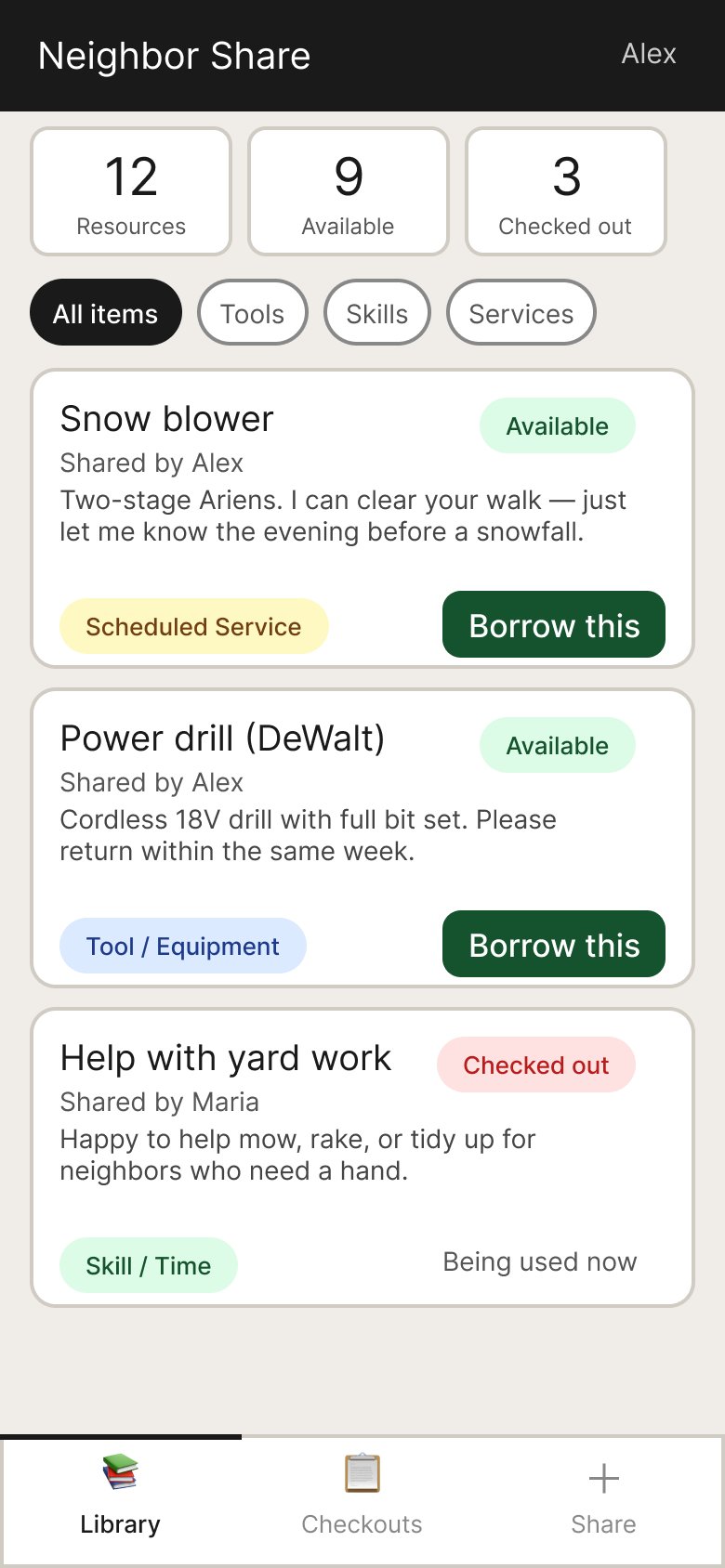
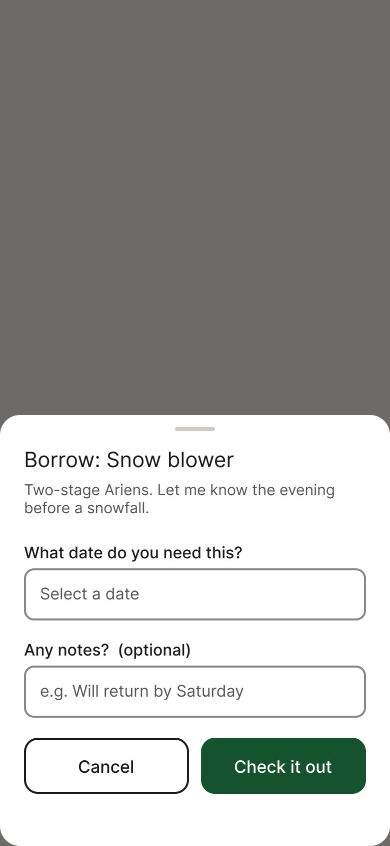
Touch targets are at least 52px, text is 17–20px throughout, and the color palette uses high-contrast pairings verified against WCAG AA. Language is deliberately plain — "Borrow this" rather than "Check out," with error messages that tell you what to do rather than just what went wrong.
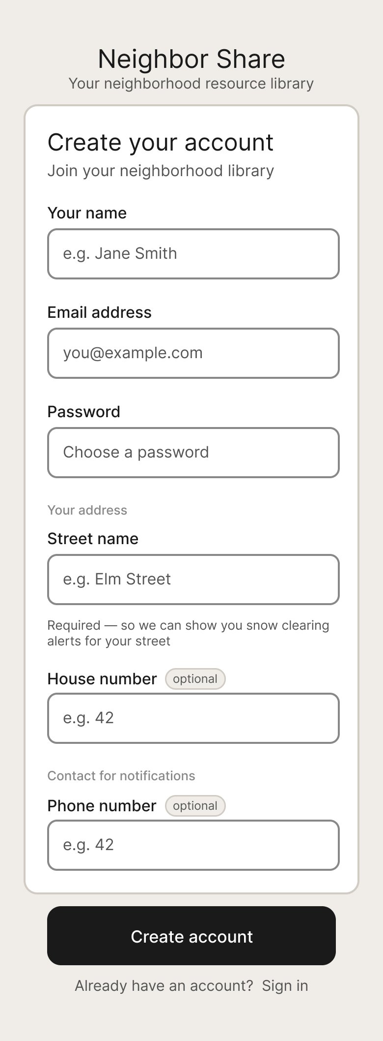
Required vs. Optional Fields
Rather than using asterisks (which elderly users often miss or misunderstand), the design uses a visible "optional" badge on non-required fields. The street name field includes helper text explaining why it's needed: "Required — so we can show you relevant snow clearing alerts for your street."
52px min touch targets
Every interactive element meets the minimum touch target size for users with reduced dexterity.
High-contrast palette
All color pairings verified against WCAG AA contrast ratios for users with low vision.
Plain language throughout
"Borrow this" not "Check out." Error messages that explain what to do, not just what went wrong.
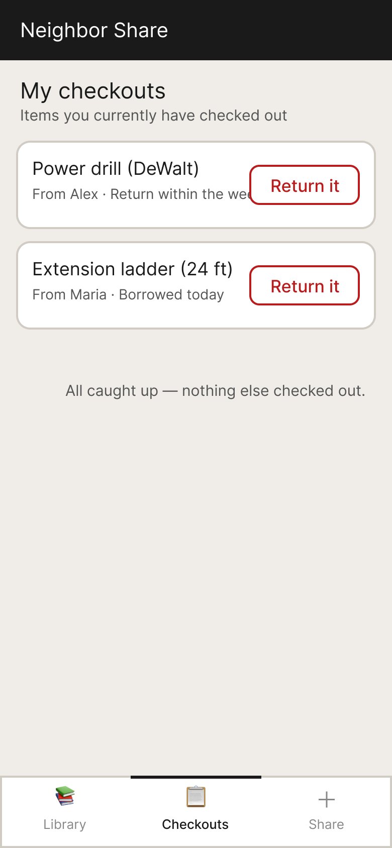
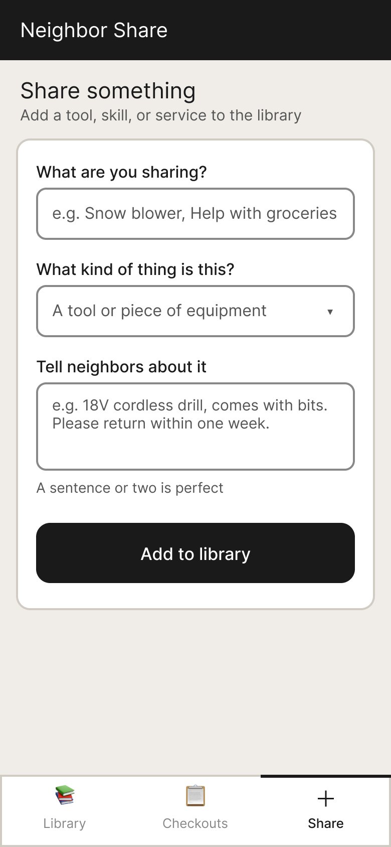
Persistent bottom navigation
Three-tab bottom bar with large icons and labels — no hamburger menus or nested dropdowns.
What this demonstrated
A complete AI-assisted design workflow
This project demonstrates end-to-end product design — problem definition, scoping, prototyping, user-centered iteration, and production-ready Figma output — conducted entirely through conversation with an AI partner.
Reflections
What I'd carry forward
Accessibility first, not last
Rebuilding the prototype around elderly users once they were identified reinforced that accessibility constraints make better products for everyone — not just the target user.
AI as a design partner
Using Claude throughout — from scoping questions to Figma MCP automation — showed how AI can accelerate the full design workflow without sacrificing quality or craft.
Scope before you design
The structured concept definition phase prevented rework later. Knowing exactly who the users are before touching Figma is always worth the time.
Plain language is a design decision
Choosing "Borrow this" over "Check out" is as much a design decision as choosing a color or typeface. Language shapes how users feel about a product.