How redesigning Niche's registration experience — with better copy, a reordered layout, and a full-page flow — made the process feel less like a form and more like a college application.
Overview
At Niche, the mission is to connect high school students with colleges through a unique matching process — flipping the traditional application system by having schools match to students based on predetermined criteria. The aim is to broaden students' awareness of available college options and encourage enrollment in lesser-known institutions.
The registration flow is the critical first step in that process. If students don't complete it, they never see their matches. Our goal was to reimagine the registration experience to make it more personalized, reduce drop-off, and make it feel less like a tedious form and more like building a profile that would unlock real opportunities.
Challenges
The existing registration flow was tedious and did not immediately demonstrate its value — leading to students abandoning the process before completing it.
The flow felt like a generic sign-up form. We needed it to feel more like creating a college application profile — making clear that this information directly connects students with schools.
Solutions
Rather than a cosmetic redesign, we focused on structural and communication changes that directly addressed why students were dropping off.
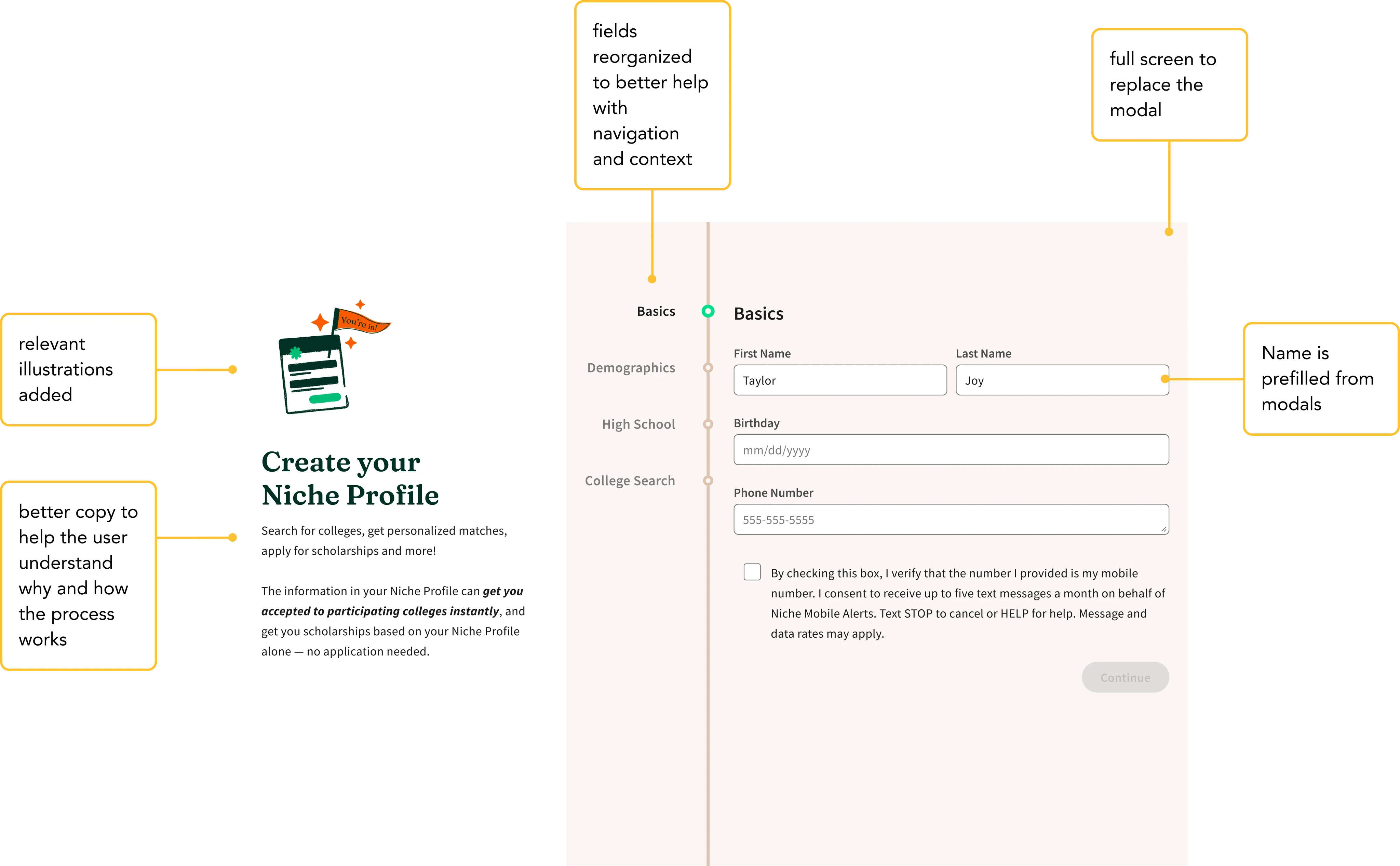
Added explanatory copy and supporting images throughout the flow to help users understand what they were signing up for and why each question mattered.
Changed the order of fields so the flow followed a more logical progression — leading with identity and interest before asking for sensitive academic details.
Shifted from a multi-modal approach to a full-page step design — reducing visual noise, improving focus, and creating a sense of progress that kept students moving forward.
Design Process
As the lead designer, I collaborated with PMs and developers to ensure the new flow integrated seamlessly with the existing registration process. Creating high-quality prototypes was essential for effective user testing throughout.
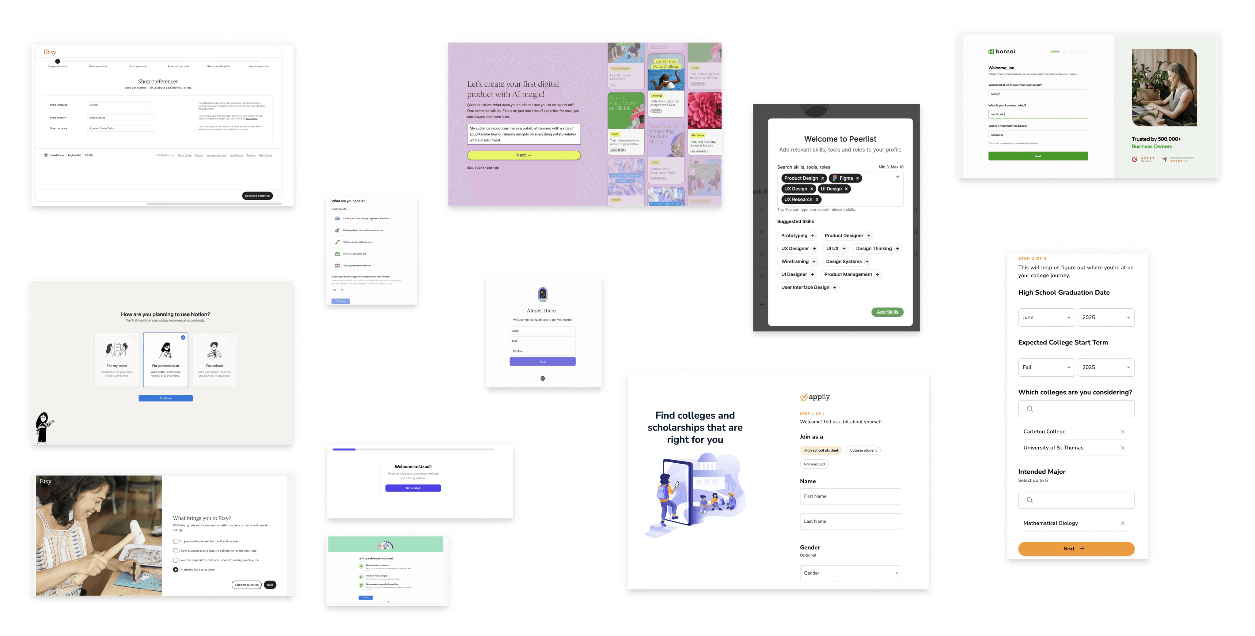
Researched similar registration and onboarding flows. Studied patterns from college application experiences to inform the new direction.
Sketched initial recommendations based on research findings. Generated multiple concepts before committing to a direction.
Built detailed wireframes, iterated based on internal feedback, and evolved designs through multiple rounds before moving to high fidelity.
Conducted 10 user interviews with high school students in the context of college applications. Refined the final design based on their feedback.
Research insights and affinity mapping
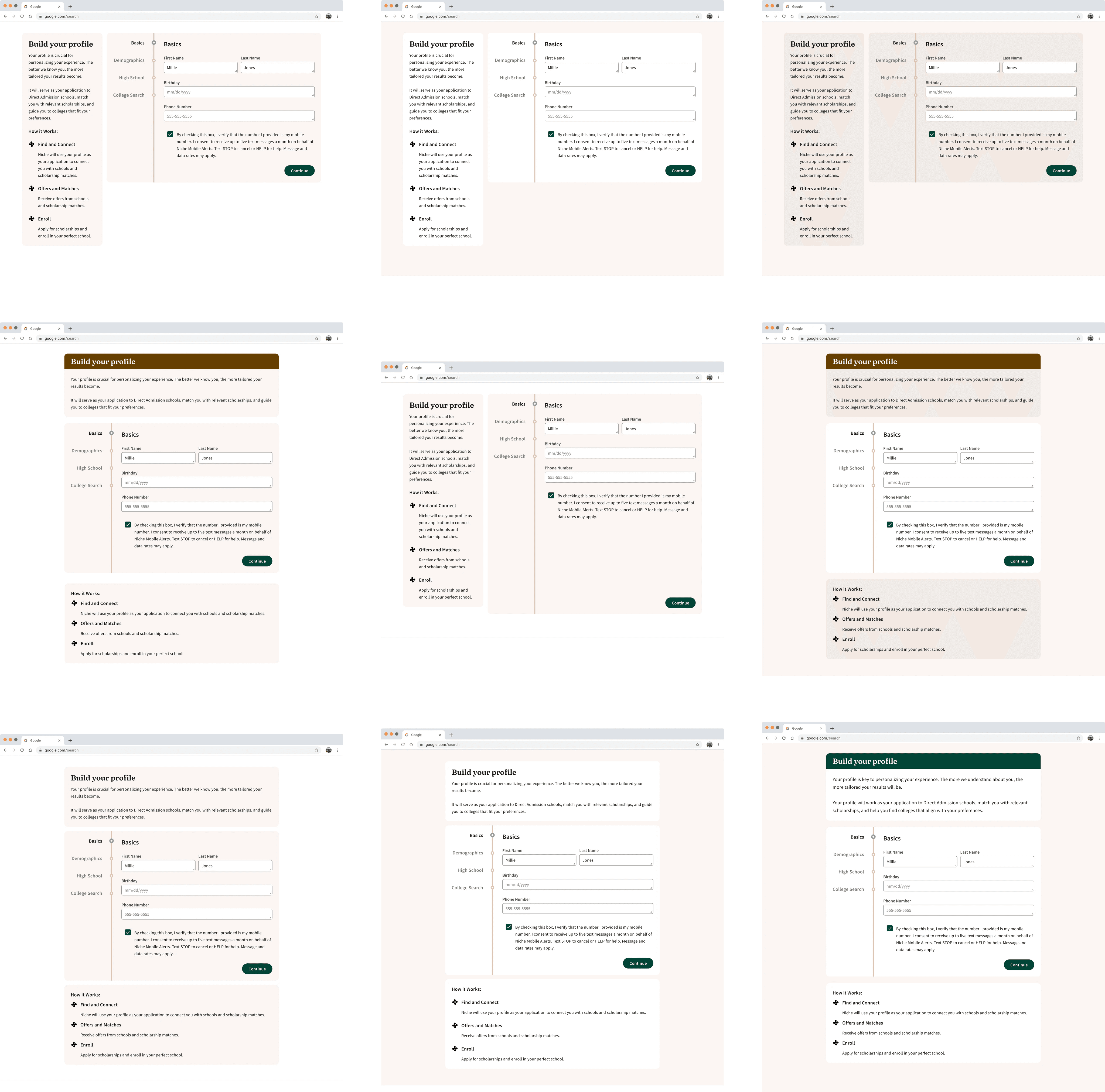
Design iterations across multiple rounds
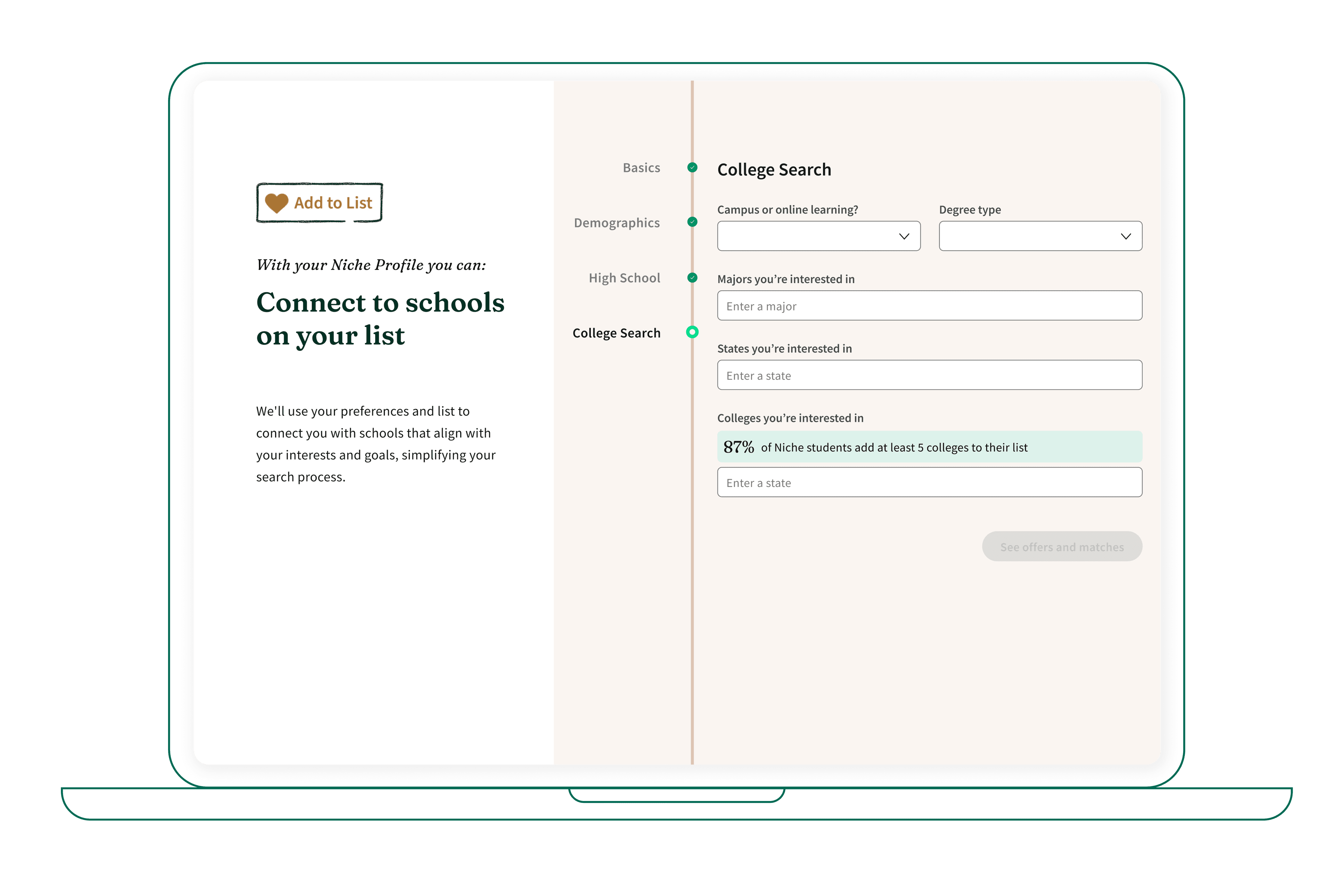
Final Designs
The final designs brought together the three core changes into a cohesive full-page experience — value-forward framing, logical step progression, and clear explanatory copy at every stage.
Final designs — the complete registration flow
Results & Impact
User feedback was overwhelmingly positive. Students indicated that the new flow provided better context for the direct admissions process and clarified the purpose of the registration — exactly what we set out to achieve.
The immediate next step is to implement copy changes to guide users more effectively through each step. Following copy finalization, the plan is to run A/B testing to compare the new version against the current one and measure which performs better on enrollment and drop-off metrics.
Enrollment growth — the largest lift from a design-led change in Niche's product history.
Reflections
The biggest improvements came from copy and framing changes, not layout changes. Helping users understand why they were being asked something reduced friction more than visual polish ever could.
Running 10 interviews before finalizing the design surfaced insights that no internal review could have caught. Students' mental models of college applications shaped every final decision.
Reordering the information architecture was unglamorous but high-impact. Getting the sequence right mattered far more than making it look polished.
High-quality prototypes were essential for getting genuine reactions from users. A low-fidelity wireframe wouldn't have surfaced the same quality of feedback.